a retro-futuristic brand for a category
that had never been disrupted
easier than you ever imagined
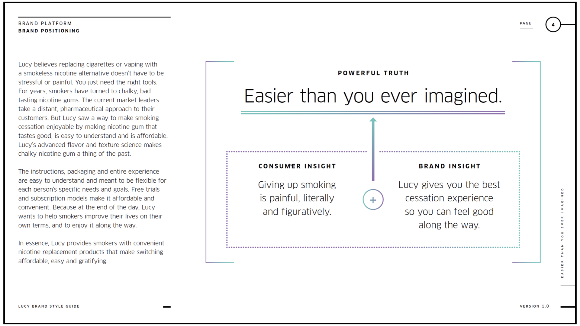
The stressful, dispassionate, failure-associated perception of nicotine gum meant there was an opportunity to position the brand as just the opposite. Simply, this is the opposite of what you think when you think of nicotine gum and quitting smoking.
charisma + intelligence
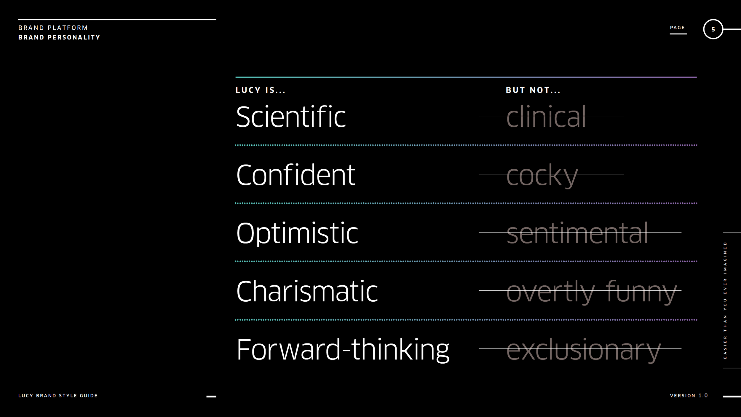
The decades-old industry leaders had familiarity on their side that was begrudgingly trustworthy. The owned “experts” as their identity, but nothing close to inventive or forward thinking, let alone charismatic.
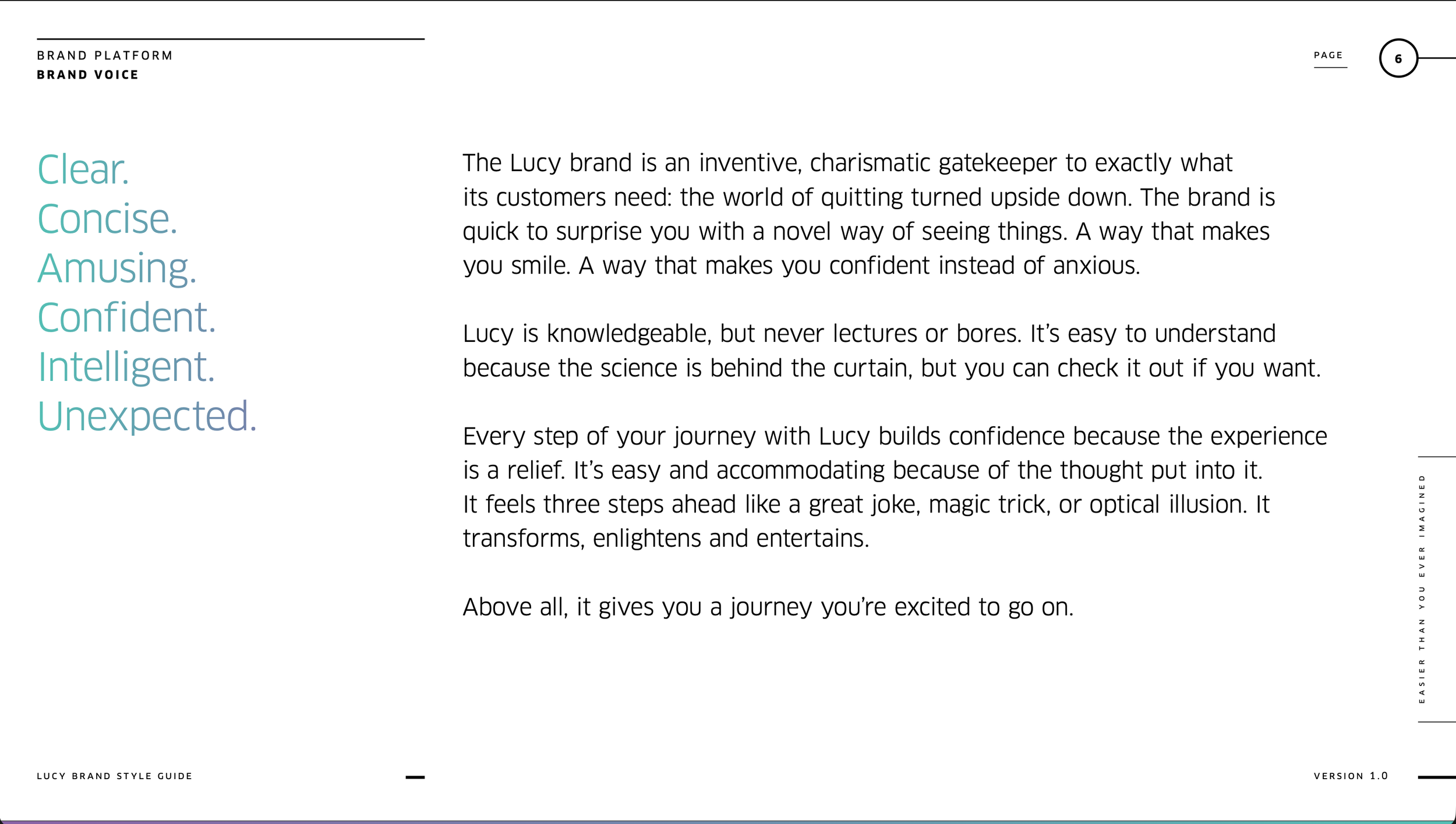
To embody Lucy’s “easier than you ever imagined” ethos, disarmed and intrigued our audience with a fully formed, charismatic personality. The juxtaposition of “scientific and intelligent” with “unexpected and amusing” gave the brand a recognizable, engaging voice — something none of their competitors had.
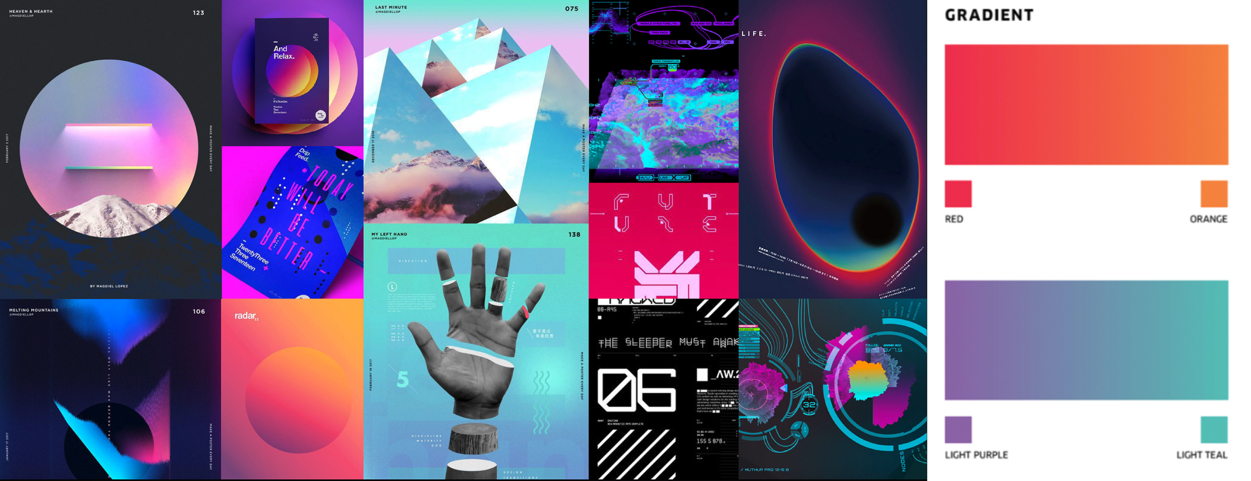
MOOD BOARD
a logo that’s optimistic for the future
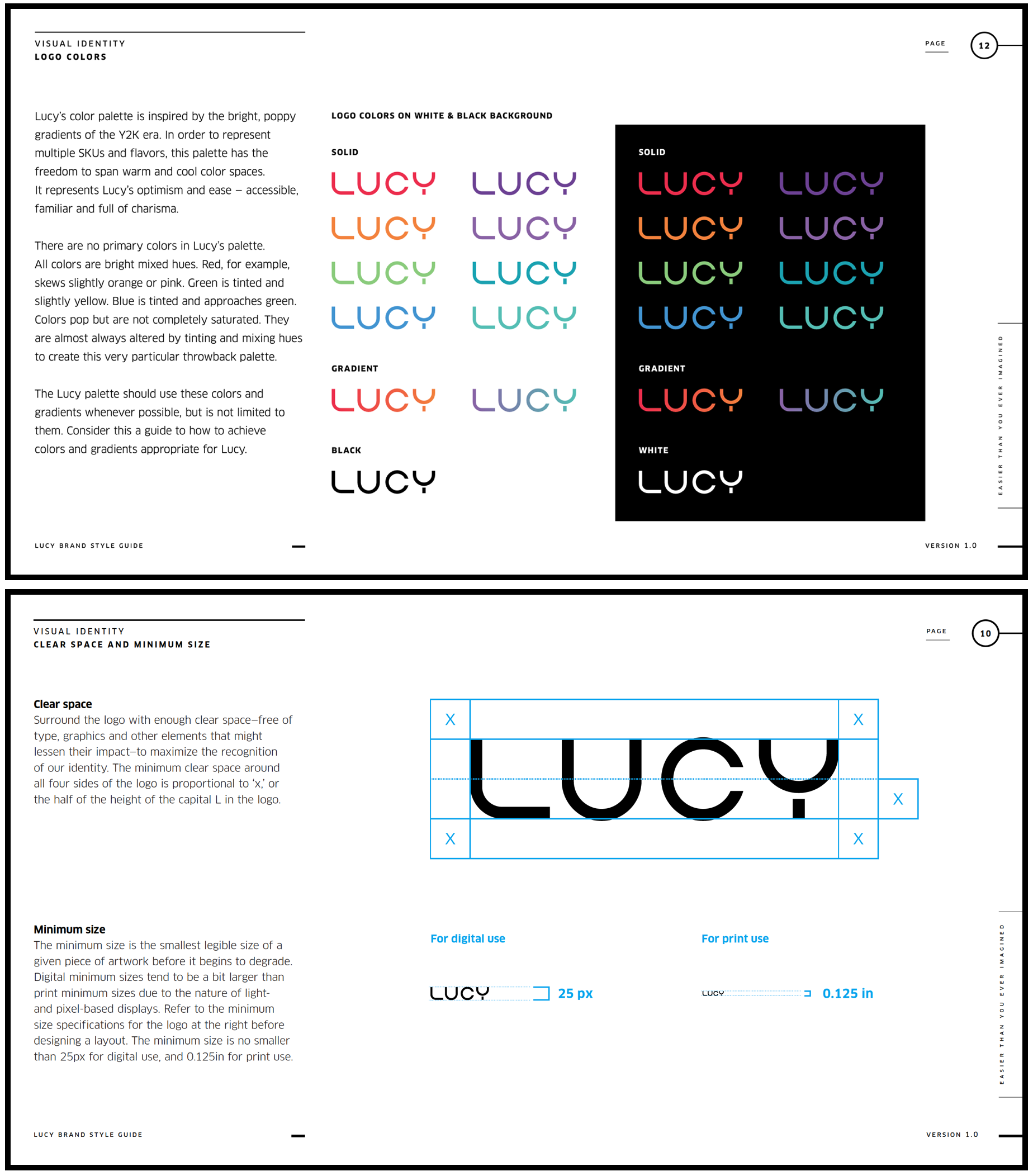
We chose a lettermark that invites you into a world you’ve never been but can’t wait to go to. Taking hints from sci-fi fonts of the ‘70s, ‘80s and 2000s science fiction, it is committed to a rounded, sculptural break from the status quo. The separated stem of the ‘Y’ represents its separation from the norm.
typography stays in character
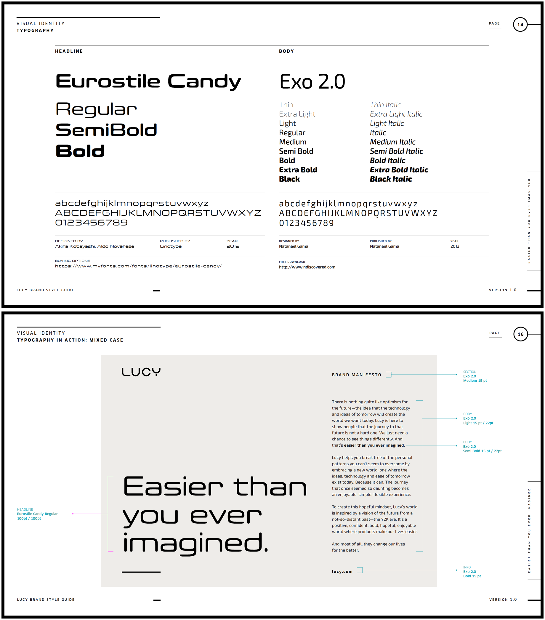
We wanted typography that fit right in with the logo and the immersive world of Lucy, but had a family extensive enough to not back the brand into a corner. Rounded, amusing, retro-futuristic options for headlines and a legible, but no less committed body font.
gradients galore
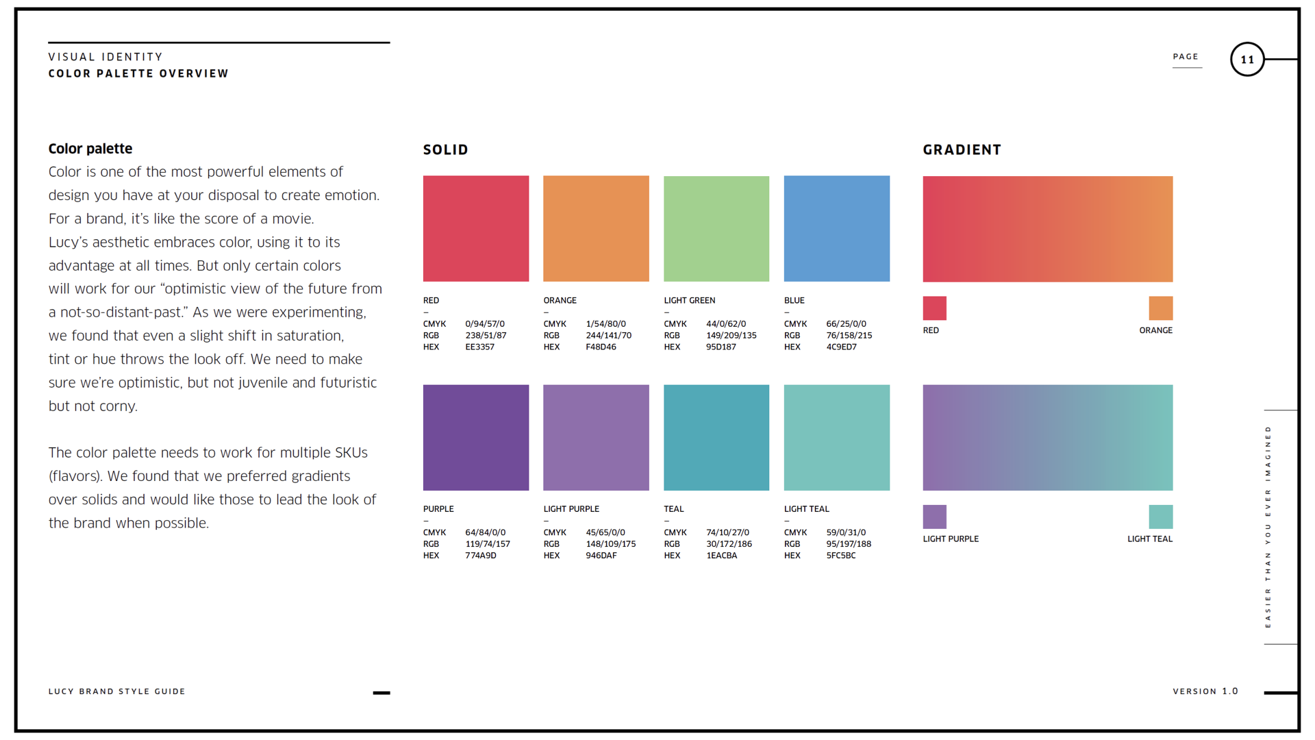
Exhausted by the drab, homogenous, greyscale world of modern branding, we went with colorful gradients that woke up our audience and represented Lucy’s different flavors. The gradients were another reminder that at every turn, the brand will step outide the norm, especially in its category.
in-world packaging
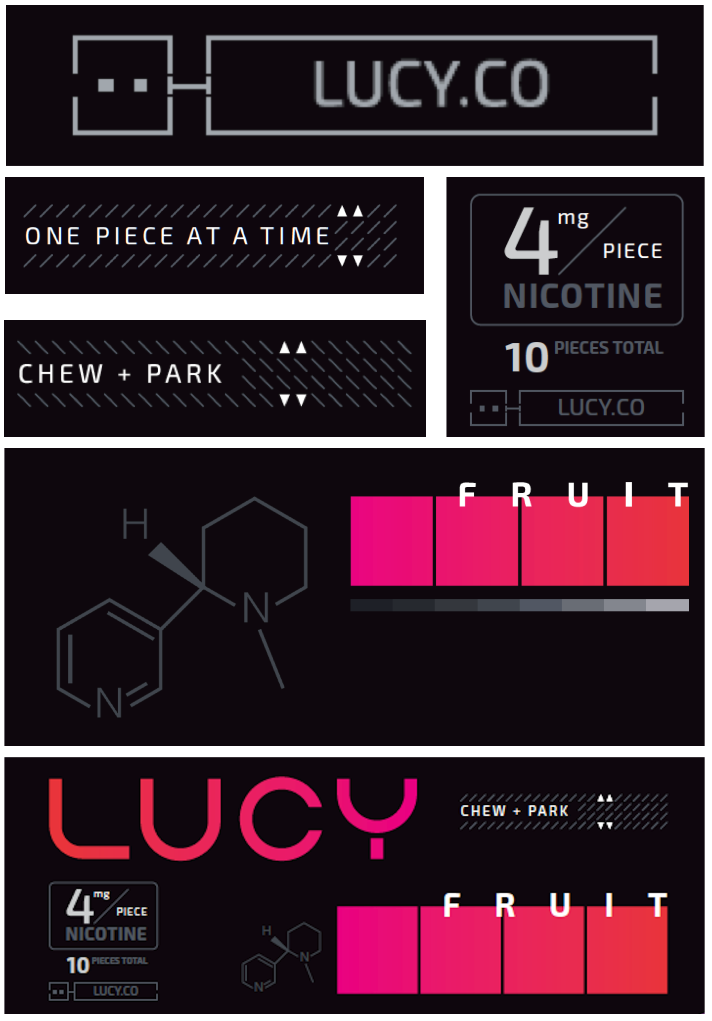
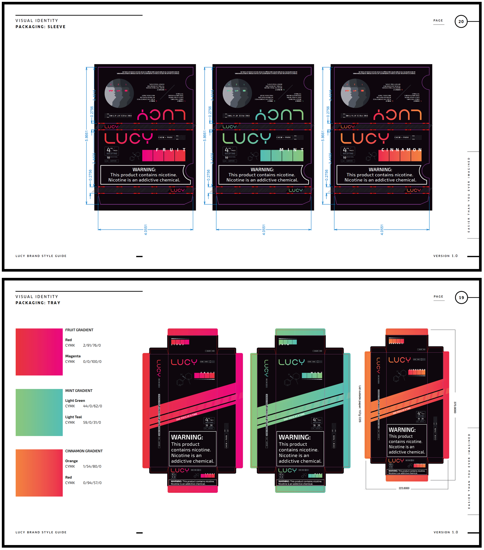
It was critical to us that the product itself feel like it was from the brand’s futuristic world, not ours. We stayed true to the brand voice by turning scientific and technical details into intriguing visual elements that are both familiar and strange at the same time. A careful mix of the reemerging acid graphics aesthetics and throwback sci-fi design tropes helped us engaging packaging that was still legible, and easy to understand.